Cyber Risk Management that actually reduces your risk
Take control of cyber risk with the only solution that translates cybersecurity controls into actionable financial prioritization, and backstops cyber losses with top-rated cyber insurance.

OUR APPROACH
Organizations must solve for cyber as both a technical and financial risk
Only Resilience brings together your security posture, real-time threats, and actual claims data—with cyber insurance—to tell you exactly which security actions will reduce your biggest financial risks.
Track: Enterprise Risk Visibility
Track vendor, business, and operational risks across all your business units and subsidiaries.

Translate: Risk Quantification
Translate your company’s technical security posture into financial impact with AI-powered risk quantification models.
Transfer: Cyber Insurance
Transfer cyber risk with top-rated cyber insurance and tools that actually help prevent losses in the first place.
Stakeholder Alignment
Bridge the gap between
risk, security, and finance leadership

CISO
Make cybersecurity a business enabler
Show executives the dollar value of your security investments—with proof they actually work.

CFO
Protect the treasury and reduce risk
Show how cyber risks impact your bottom line, predict potential losses, and prove your security budget is worth it.

RISK MANAGER
Transfer risk through cyber insurance
Lower your cyber risk with the solution that actually prevents losses.
CYBER RISK MANAGEMENT
Everything you need to measure and manage your cyber risk
Get comprehensive cyber insurance for when you need it, plus tools to prevent losses in the first place.
Top-rated coverage with broad market appetite
Experienced, sustainable underwriting
24/7 in-house claims and incident management

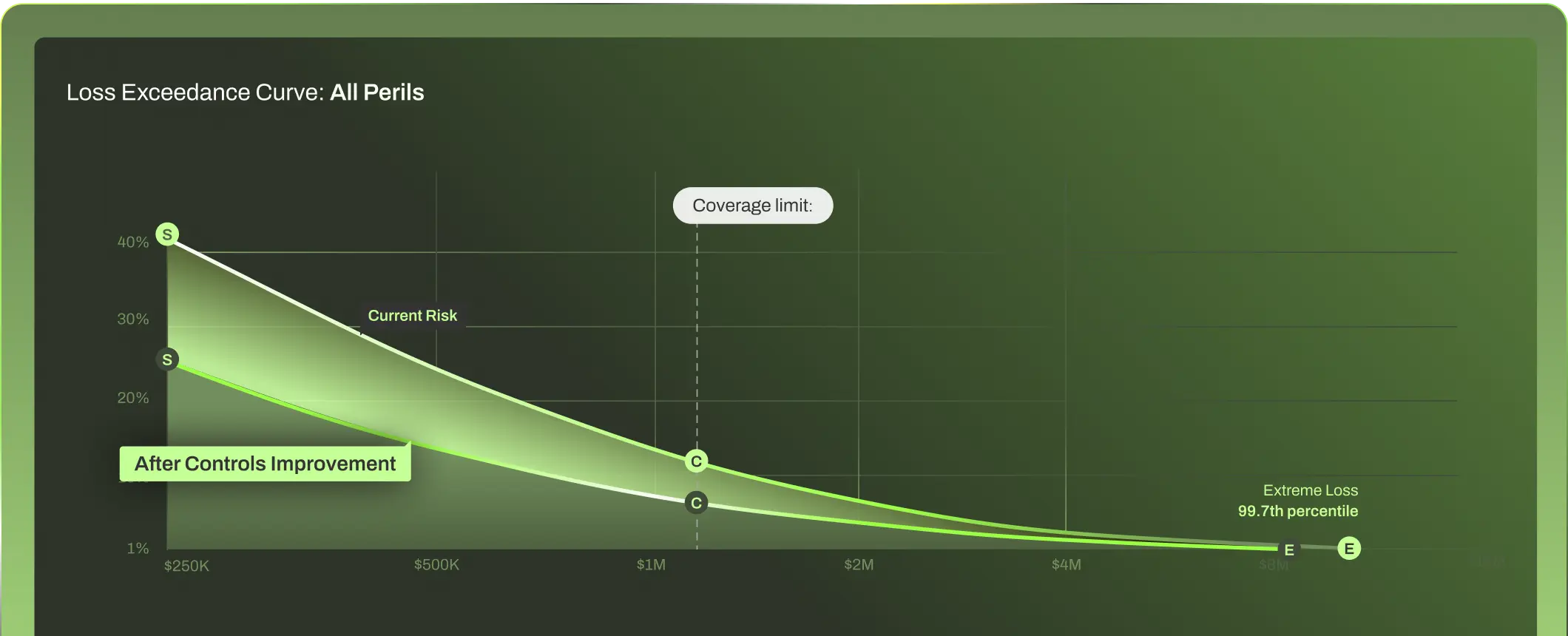
Prioritize the risks that matter most to your business—quantified using real claims data and validated by security experts.
Real-time risk monitoring and mitigation
Financially quantified controls prioritization
Real-world attack scenario testing and validation
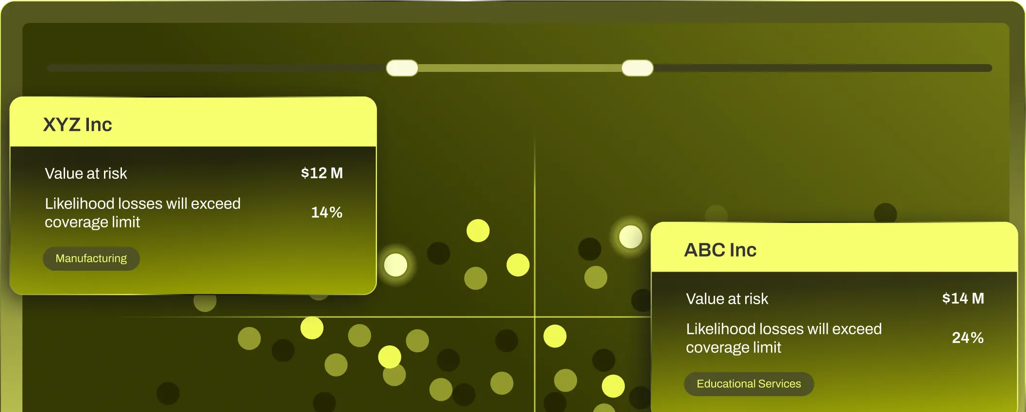
Get ongoing, dollar-based risk assessments for your entire organization—completely automated.
Automated risk assessments for every subsidiary and business unit
See which security controls matter most—ranked by dollar impact
Monitor threats across your entire organization from one place
![]()
WHY RESILIENCE?
See what the Resilience Solution has to offer
Make data-backed, informed decisions
CYBER ACTION PLAN

Stop wasting budget on controls that don’t actually work. We help you manage cyber risk the same way we underwrite it—by analyzing proven claims data to create clear, dollar-based action plans.
Justify and prove the value of your security program
CYBER RISK QUANTIFICATION

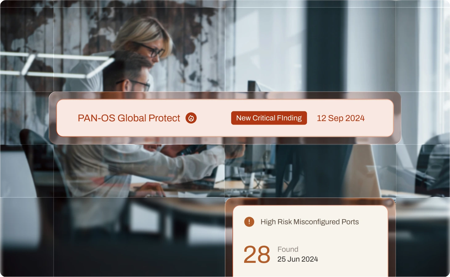
Know which vulnerabilities can drive material loss
RISK OPERATIONS CENTER
Create ongoing visibility into your entire portfolio
MULTI-ENTITY & PORTFOLIO RISK

BROAD MARKET APPETITE
A global partner you can count on
Available Coverage
Cyber Insurance, Tech E&O
Industries Covered
Healthcare, Higher Education, Financial Institutions & Financial Services, Manufacturing, Construction, Law Firms, Professional Services, Public Entities, Retail, Hospitality, Technology, Life Sciences, Medical Devices, Pharmaceuticals

Available Coverage
Cyber Insurance, Tech E&O
Industries Covered
Healthcare, Higher Education, Financial Institutions & Financial Services, Manufacturing, Construction, Law Firms, Professional Services, Public Entities, Retail, Hospitality, Technology, Life Sciences, Medical Devices, Pharmaceuticals

Available Coverage
Cyber Insurance, Tech E&O
Industries Covered
Healthcare, Higher Education, Financial Institutions & Financial Services, Manufacturing, Construction, Law Firms, Professional Services, Public Entities

Available Coverage
Cyber Insurance, Tech E&O
Industries Covered
Healthcare, Higher Education, Financial Institutions & Financial Services, Manufacturing, Construction, Law Firms, Professional Services, Public Entities, Retail, Hospitality, Technology, Life Sciences, Medical Devices, Pharmaceuticals

Available Coverage
Cyber Insurance, Tech E&O
Industries Covered
Healthcare, Higher Education, Financial Institutions & Financial Services, Manufacturing, Construction, Law Firms, Professional Services, Public Entities, Retail, Hospitality, Technology, Life Sciences, Medical Devices, Pharmaceuticals


REPORT
2025 Cyber Risk Report Shows the Impact of Cyber Resilience
Get the latest trends and analysis in cyber claims with our 2025 Cyber Risk Report and see how we’re helping organizations build Cyber Resilience.
CUSTOMER STORIES
See the business impact of
cyber resilience in action


RESOURCE CENTER
Stay ahead of cyber risk with the latest intel and insights

The time for
Resilience is now